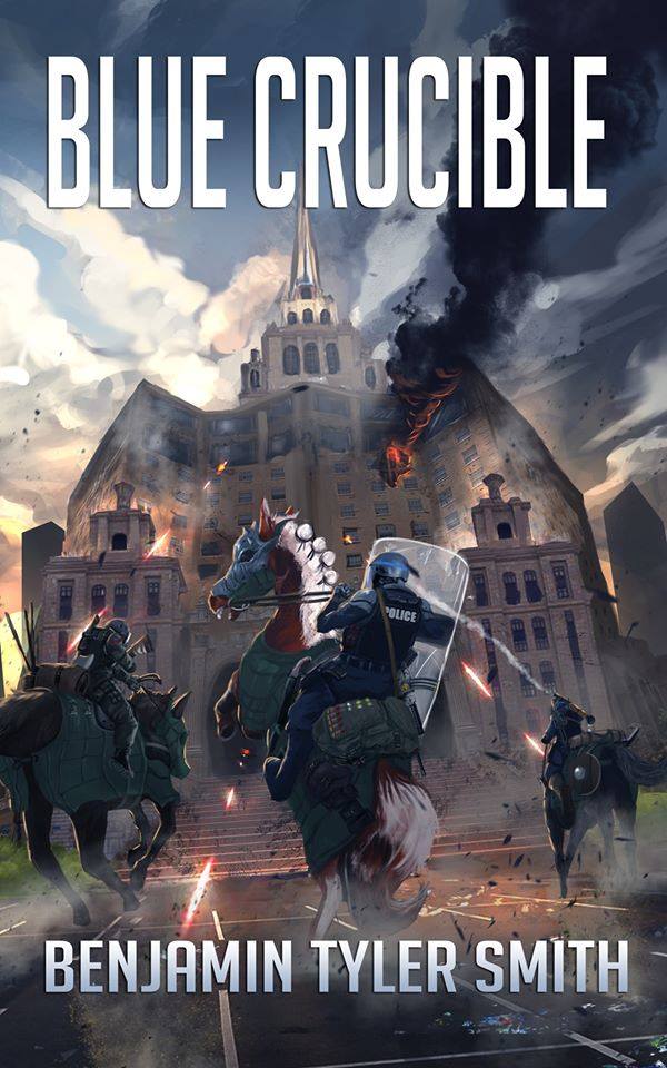
Since my publisher went public with it, I can only assume I’m free to post about it here. All I can say is, wow. I’m absolutely blown away by this cover art. Never in my life did I expect my very first novel would have this kind of artwork.

And the coolest part about it is Chris let me help design it. He came to me back in early December after I announced the draft was finished, and asked what I would like on the cover. From what I understand of traditional publishing, this isn’t typically how it’s done. The big firms have marketing departments who figure all that out. Authors get a little bit of input, but not much. Depending on the author, anyway. I laid out a few ideas based on scenes from the book, and this was the one we decided would be best: a crazy charge into the hotel the bad guys are holed up in at the climax of the book.
I forget what the third idea was, but the second one was a close-up shot of the main character, Lieutenant Nathan Ward, charging towards the “camera” with mounted officers behind him. We axed that idea pretty quickly because Amazon has some new weird rule for cover art that effectively bans any kind of artwork where weapons are being pointed at the “reader.” Why, I don’t know. The audience has been getting shot by James Bond for decades and there hasn’t been any outcry over it that I’m aware of. But, such is life. And this cover art turned out amazingly well. I would argue it’s the best Fallen World artwork so far, but all of it’s excellent. Elartwyne Estole just gets better and better!
